PROJECT OVERVIEW

Barnes & Noble

The project’s purpose was to add a new feature to an existing website. The workflow included research, interviews, design, and usability testing. This project was developed as a part of Designlab’s UX Bootcamp.

Barnes & Noble is one of the largest American bookstore chains; they sell books, music, stationery goods, and some select locations have cafes. Barnes & Noble is a successful business, but there is still room for improvement. This project explores possible solutions to further improve customers’ online shopping experiences.

Strategy planning

Role

User Researcher

Visual Designer

Branding Designer

Interactive Designer

Tool

Figma

Adobe Illustrator

Duration

4 Weeks

Problem

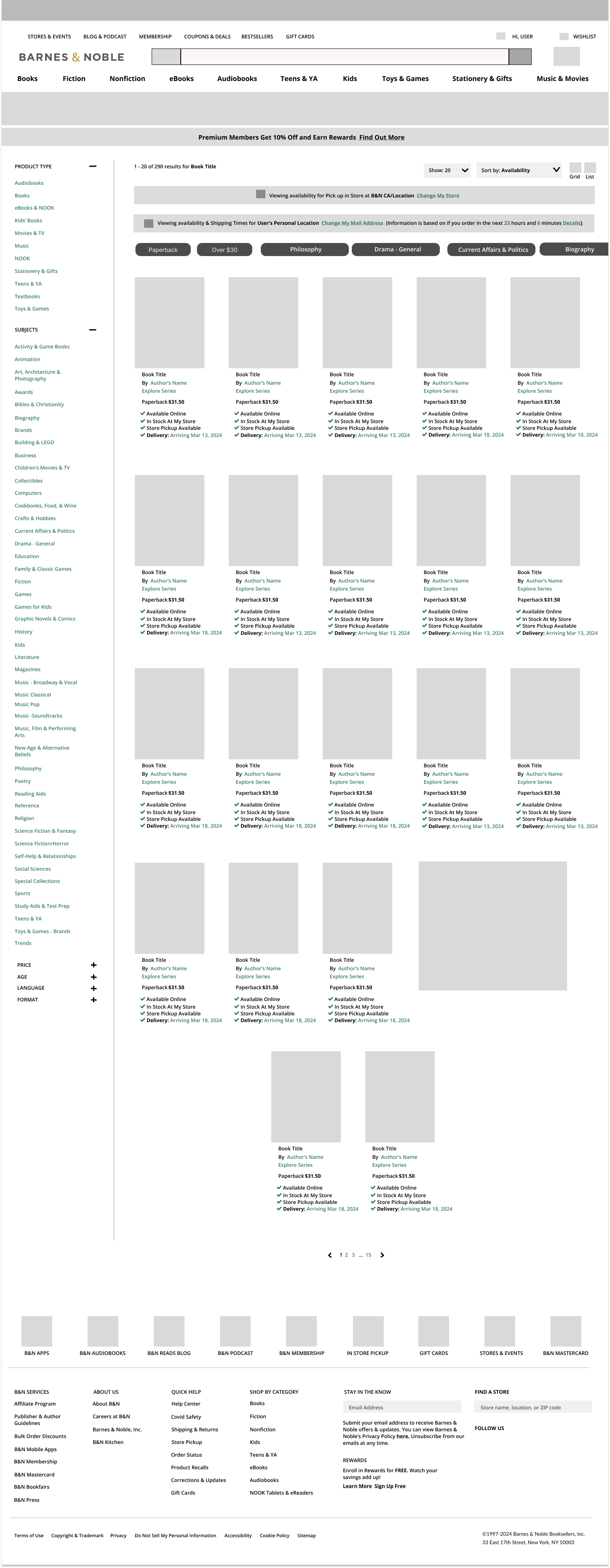
Barnes & Noble can benefit by improving their products’ discoverability on their website. As of now, the website primarily promotes their products with recommendations. Such “Book Club” picks, themed cultural events, award lists, and “Book Tok” category. These recommendations improve product discoverability, but they seem mainly appeal to specific demographics. Barnes & Noble needs additional feature to they promote more books to a boarded range of people.

Solution

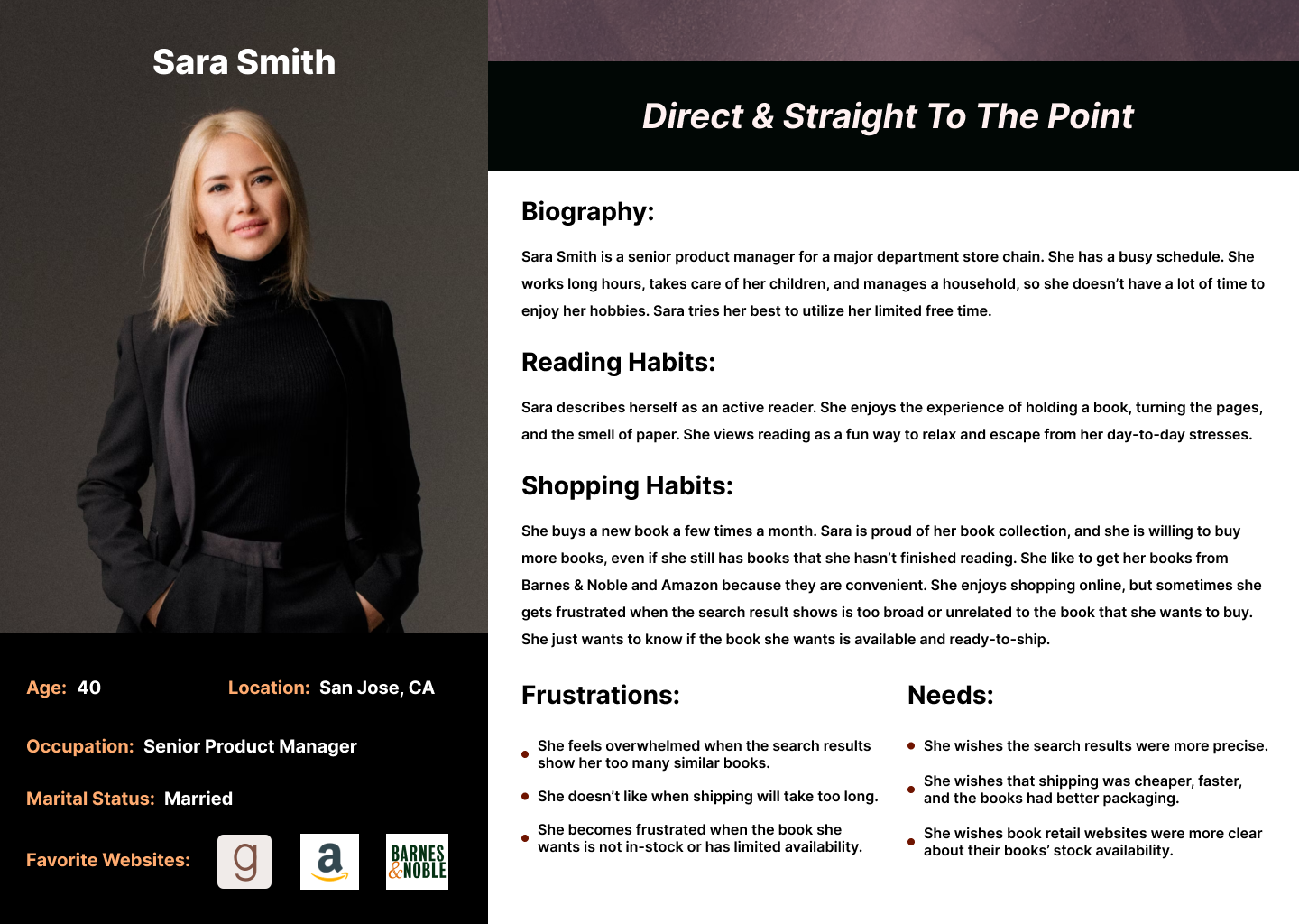
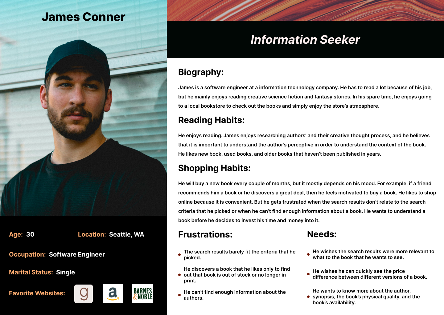
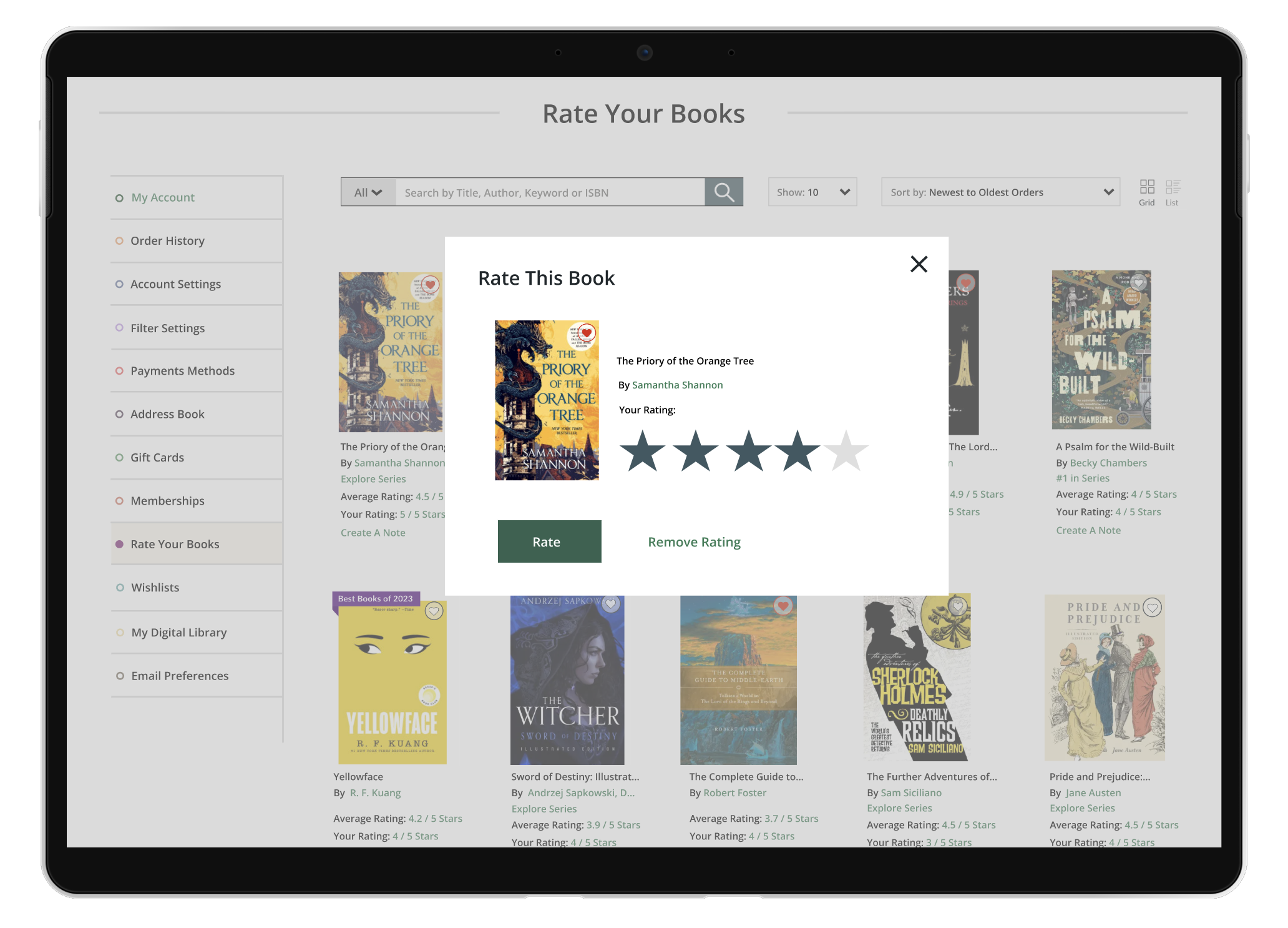
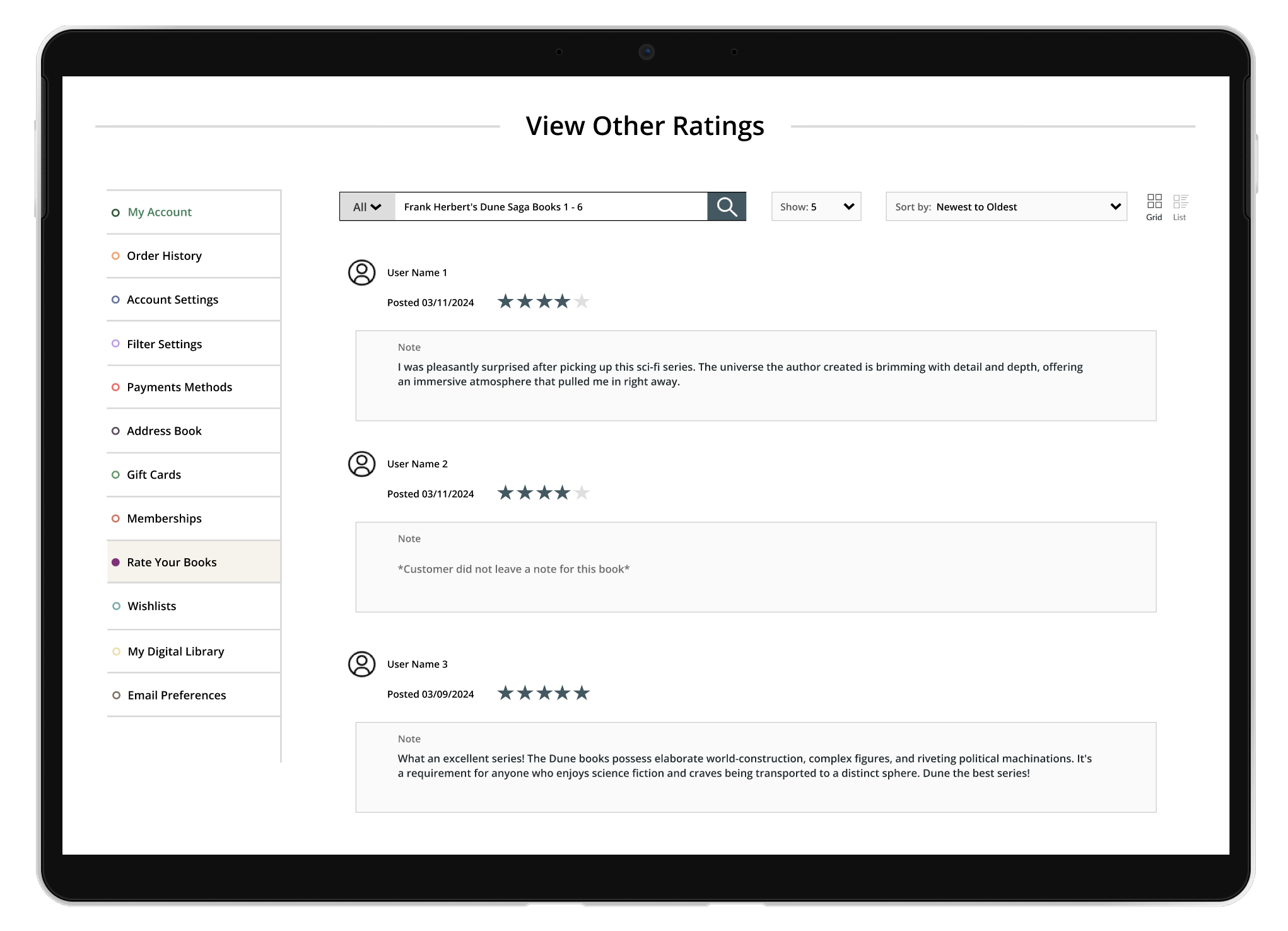
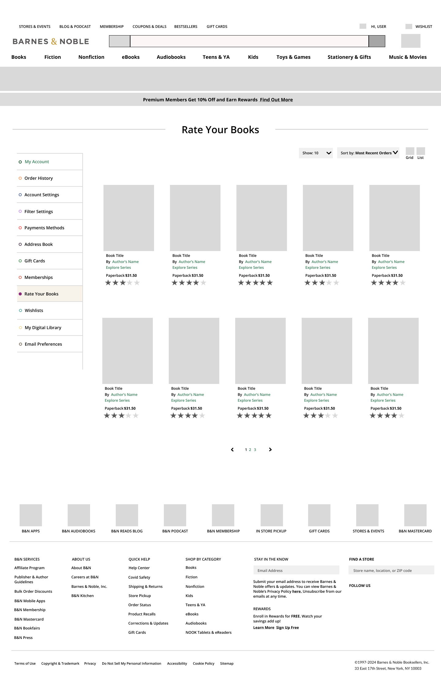
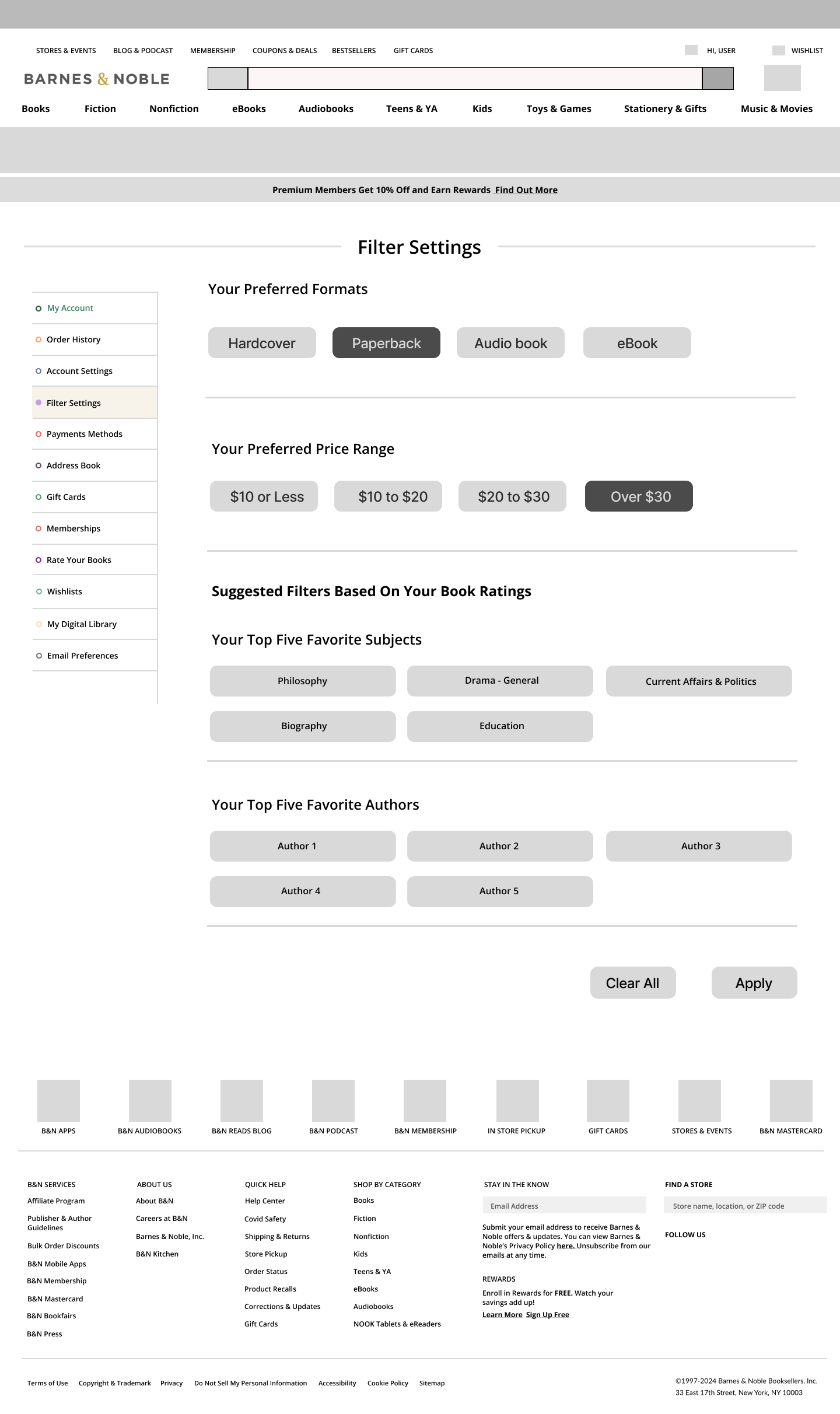
The research stage looked over different solutions for the problem. My first hypothesis was that people would be interested in a personalized book recommendation system. This filter would recommend books based on the user’s purchase history, favorite list, and reviews. However, after I conducted the interviews, it was evident that most participants wanted to see new improvements to the filter system and search process.

Goal

The goal is to improve Barnes & Noble’s products’ discoverability and customers’ overall online shopping experience. The new feature must be simple, easy to use, easy to understand, and work with the rest of the website’s current features and services.


Research Stage

The research stage closely examines and test different solutions for the problem. This stage explores the current trends in online retail stores, defines user’s needs and point points, develops and tests some possible solutions.

Competitive Analysis

Barnes & Noble have many successful competitors such as Amazon, Goodreads, Half Price Books, Abe Books, and independent bookstores. The competitive analysis looks into how these companies promote their products to their customers.

Interviews

The participants are active readers who enjoy collecting books. The age range is from 25 to 60 years old. They actively read because of their education, career, or for their own personal entertainment. Among all the demographics, this group is most likely to frequently use online book retail stores.

Key Takeaways From The Interviews

Majority of participants described feeling frustrated by out-of-stock availability and slow shipping times, and they often wish there were easier ways to find out if a book was in stock and ready to ship.  

Most participants say that customers reviews influence their decision to buy a book. If a book has too many bad reviews or little to no reviews, then they are less motivated to buy that book.

Participants dislike getting unrelated book results. They feel like sometimes the results are all over the place, and some participants described feeling overwhelmed when there are too many options. Most participants wished that Barnes & Noble’s filter system allowed narrow down the search by specific criteria like price, genre, and medium. 

Affinity Mapping

User Personas

I divided the participants into two groups: people who want their shopping experience to be quick and simple, and people who want to take their time and learn everything they can before they invest their time with a new book. 

The first persona represents someone who doesn’t want to spend a lot of time browsing or waiting for a book to ship out. They want to know if the book is available (in-store or online), and which books have good shipping times.

The second persona represents someone who wants to learn about the book before buying. This person wants to know the author, the book’s print quality, and the price difference between the different versions of a book. They want specific information about the books they are interested in buying.

Persona 1: Direct & Straight To The Point

Persona 2: Information Seeker

Research POVs

1. I’d like to explore ways to help readers get more precise and relevant search results because they feel overwhelmed when they see too many books that don’t meet their searching criteria. 

2. I’d like to explore ways to help book collectors find more information about the books they want to buy because they want to make an informed decision before they decide to buy a new book. 

3. I’d like to explore ways to help readers find books that are available and ready to ship because this will help make readers’ online shopping process easier and less frustrating. 

Research HMW

1. How might we make book stock availability information more transparent to users?

2. How might we promote books that have quick shipping times?

3. How might we utilize our search feature to improve discoverability for in-stock books?

4. How might we help users feel more confident that they can find their highly anticipated books available on our website?

User Flows

Research Wrap-Up

After conducting the competitive analysis, interviews, user personas, the research POVs and HMWs and user flows, it was time to develop and test possible features for the website. 

Overall, the research findings showed what participants want is to have more features to make online shopping more convenient and simpler. It was possible to split the participant group into two groups; people who want a quick and decisive shopping process, and people who want to research the book’s author, background, and reviews before they decided to buy a new book. These two groups have different perspectives about shopping, however, they both still value convenience and simplicity with their shopping experience. 

The new features need to address all the needs and frustrations that were discovered during the research stage. The design stage will further develop the new features, and test if they successfully meet the users’ needs and frustrations. 

Design Stage

The design’s aesthetics were primarily based on Barnes & Noble’s current existing design and branding guideline. The new features needed to adhere to the company’s branding guidelines in order to seamlessly incorporate them into the website. Design process involved design research, wireframes designs, prototype design, and usability testing. 

Mid Fidelity Wireframes

The initial concept was that the users could customize their own shopping experience with personalized filters. Users can rate their pervious purchased books in the book rating page, and the filter setting system would recommend new filters based on the user’s rating. For example, if a user gives fantasy books 5 star ratings, then the system would recommend the fantasy genre filter. My hypothesis was that this could increase discoverability and more accurate search results. However, testing results quickly disprove that hypothesis. 

Most participants like the book rating system and some of the filter options. They saw a lot of value in the stock availability, shipping times, price range, and medium filters, and they could easily see themselves using these features. But they didn’t feel the same way about the genre filter and the author filter. Participants thought the personalized filters option was confusing. Likewise, a participant mentioned how there could be a lot of problems with this system, such as, it’s possible the algorithm could suggest filters for unrelated authors or genres because of a bias towards certain genres. The algorithm would have to make a lot of assumptions based on the user’s subjective reason behind their book rating. Speaking of book ratings, participants didn’t understand why the system didn’t allow them to create notes or view other user’s book reviews. Participants who highly value book ratings mentioned that viewing other customers’ reviews is one of the most aspects of any rating system. 

It was clear the filter settings needed to be updated. The filter settings and the book rating system needed to be reworked and expanded to meet the user’s needs. 

The mid fidelity wireframes look over the new features; The new sorting filters, stock availability and shipping times, the personalized filters, the filter setting page, and the book rating page.

Mid Fidelity Wireframes Close Up

High Fidelity Wireframes

The high fidelity wireframes expand on the original features from the mid fidelity wireframes. The filter system and the book rating system now include the features that the last group of participants wished to see in the concept.

The filter system had a lot of changes. First, users have the option to set an address on the search page. The system will calculate products’ shipping times based on the address that user sets as their “home address”. The products’ shipping times update in real-time, so the product results will always include an accurate shipping time estimation. Users can sort results based on stock availability, shipping times, and personalized filters. The new personalized filters allow users to select their own preferred format, price range, offers, editions, and product release. I replaced the author and genre filters with offers, editions, product released filters. Now, users can easily discover “best sellers”, “best reviewed”, books with coupons & deals, box sets, collector’s edition books, and signed editions. Users can also search for recently announced products, coming soon products, and newly released products. Users have the option to customize their shopping experience with just a few filters. 

The second feature that had a big expansion was the book rating system. Participants wanted to see more with this feature. Such as the option to write notes, be able to sort the books, a specific search feature for this page, and the option to view other customers’ reviews. The new book rating system now includes these new additions. For instance, there is a specific search bar just this system. Users can now sort their books according to “Newest to Oldest Orders”, “Oldest to Newest Orders”, “Publication Date – Newest to Oldest”, “Publication Date – Oldest to Newest”, “Your Favorites”, Average Rating – High to Low”, and “Average Rating – Low to High”. All books show the user’s personal rating and the average customer rating. Users can create notes with the books ratings. Lastly, users have the option to view other customers’ product reviews.

The high fidelity wireframes include new expansions made to the features; such as an address setting option, changes to the filter setting, additions made to the book rating page, and the option to view other customers’s reviews. 

Prototype

The prototype allows participants to fully explore the new features. I carried out another usability test for the high fidelity wireframes. Overall, participants praised the recent changes made with the filter system and the book rating system. Participants thought the new features were easy to use, easy to understand, and very convenient additions to the website. 

Prototype Test Link

Conclusion

The biggest key takeaways that I’ve gained from this experience: It’s important to keep an open mind during research, never assume a solution, always seek to learn from others, take the time to test features, and keep making iterations until you discover the best solution to a user’s problem.

This project was a great way to learn more about the current standards and trends in UX design. For example, I didn’t realize that I had a habit of making my elements & text too large until I studied the Barnes & Noble website. Barnes & Noble website has a lot of content, however it didn’t feel overwhelming or too cluttered because they use a lot of different techniques such as hierarchy, visual elements, and color, to make users’ shopping experience easy and enjoyable. 

This project was a wonderful opportunity to learn and grow as a designer, and I greatly appreciate the guidance and feedback that I got during this project’s development. 

View more case studies

Restful Support

Green Room

Academy Hive

Want to connect?